The client wanted to target each age group, each gender and each interest. Hence they had a huge list of wishes which were needed to be fulfilled to ensure that they provide the content suiting for each and every need.

The client already had its app running. They didn’t want to take the app off the App Store and Play Store. They didn’t want to cut the connection with the users. Hence the changes so made were to be done in the regular updates and not in through the maintenance pause.


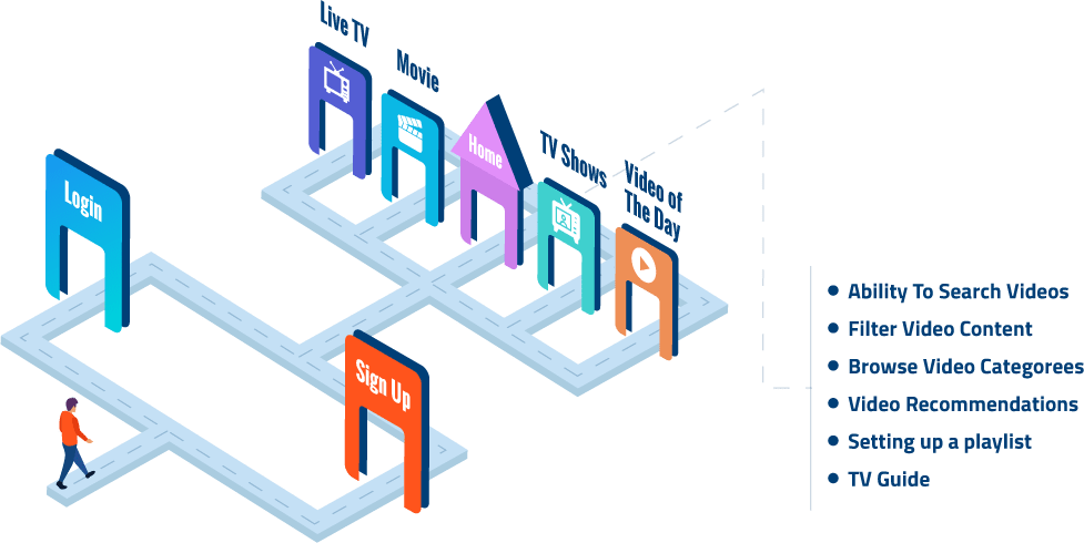
The wireframe was finally set and a blueprint was taken out of how the app would look like. Then the concurrency was to be set higher than it was before so that the efficiency may increase.

We used the bright colour palette as it can suit the tastes of a varied section of interests.

We kept the previous interface of the app in mind and made usage of the white spaces so that the app is seamlessly operable by a varied age bracket.

We attempted to make a change in the app’s base by updating the app being used. This helped increase the app’s concurrency.

Since the process of changing was through the constant updates, a close look was kept on the user interaction. This helped understand the changes being liked by the users and denied by them.


The new app so formed witnessed high concurrency which further led to high streaming time and more than 25 million downloads. The App Stores were sprawling with the positive comments and reviews which further proved that the changes made took many odds to their favors.