Some of the medical cases are so complex that both patient and the doctor have to keep a regular check on the status. Physically, it was not possible to be in touch for such a long time. Hence, a system was required to cater to these problems.
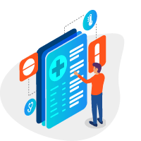
It is most commonly seen that patients do not fulfil their medical course and start becoming negligent once they start feeling good. This can prove to be fatal and hence a system was in demand through which a regular check could be kept on the patient activity.

A communication between the doctor and the patient can sometimes be distorted due to many intermediary channels. Through an app like this, all the intermediaries could be removed and the patient could get direct help from the experts of health care.

We have placed a categorization system by which the doctors can prioritize their case. The prioritization can depend upon the severity of the condition.

Sending some common or bot-made notifications to the patients would be being negligent. Hence, a system was devised through which personalized follow-up notifications could be sent to the patients according to their individual cases.

We added an option for the patients to scan their medical reports on the app only. In any case, if a patient loses his physical documents, he would have them saved on the app for the reference.

All patients can never be tech-savvy. Hence we built an app which is easy to use and faster to understand. It not just brought convenience but also blessed them with comfort and expanded usability.

Electronic Health Rating needed to be integrated with Remote Patient Management. We strived to ensure that we integrated the best and state of the art devices with the software so that health ratings can be taken in the real-time with the most reliable sources.

After all the designs and colour schemes were set, we figured out the final wireframe for the application. After that, each function was taken as a different project for individual attention. Constant running, experimenting and testing were done, keeping the developers, and the client in a closed loop.

Whole of the app was made in an efficient manner where a few taps could lead to major differences. We do not want the sufferer to suffer from multiple steps. Hence, we made a system which is easy to understand and quick to execute.

The main emphasis was given on the cold colours because they could enhance the sense of tranquillity and help the users concentrate on the important features. San Fransisco Pro Font Family was used for typography for its clear wordings and equilibrium in the spacing. Moreover, it looked like both- professional and user-friendly.

Patients were suggested to have a mobile app instead of a website link because they have to fill particular information at the time of their login. An app would have been much convenient in these regards.

Doctors have to take care of a huge medical database. Having a proper system for that would have been good. Moreover, a doctor has a desk job which is suitable for a desktop app.
